PipelineProfiler
Published:
Github: https://github.com/VIDA-NYU/PipelineVis
Paper: https://arxiv.org/abs/2005.00160
Abstract: In recent years, a wide variety of automated machine learning (AutoML) methods have been proposed to search and generate end-to-end learning pipelines. While these techniques facilitate the creation of models for real-world applications, given their black-box nature, the complexity of the underlying algorithms, and the large number of pipelines they derive, it is difficult for their developers to debug these systems. It is also challenging for machine learning experts to select an AutoML system that is well suited for a given problem or class of problems. In this paper, we present the PipelineProfiler, an interactive visualization tool that allows the exploration and comparison of the solution space of machine learning (ML) pipelines produced by AutoML systems. PipelineProfiler is integrated with Jupyter Notebook and can be used together with common data science tools to enable a rich set of analyses of the ML pipelines and provide insights about the algorithms that generated them. We demonstrate the utility of our tool through several use cases where PipelineProfiler is used to better understand and improve a real-world AutoML system. Furthermore, we validate our approach by presenting a detailed analysis of a think-aloud experiment with six data scientists who develop and evaluate AutoML tools.

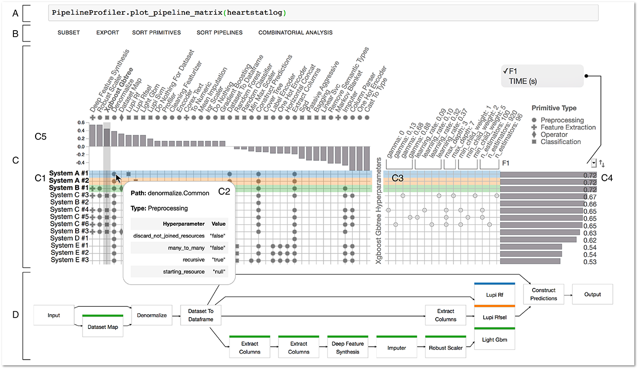
PipelineProfiler applied to the analysis of binary classification pipelines generated by five AutoML systems for the Statlog (Heart) Data Set. A) The system is integrated with Jupyter Notebook and can be used with one line of code. B) PipelineProfiler menu, with options to subset, export, sort and perform automated analysis on pipelines. C) Pipeline Matrix: C1) Primitives (columns) used by the pipelines (rows). C2) Tooltip showing the metadata and hyperparameters for a primitive. C3) One-hot-encoded hyperparameters (columns) for the primitive Xgboost Gbtree across pipelines (rows). C4) Pipeline scores: users can select different metrics to rank pipelines. C5) Primitive Contribution View, showing the correlations between primitive usage and pipeline scores – here, we see that Deep Feature Synthesis has the highest correlation score with F1 scores. D) Pipeline Comparison View: visual comparison of the top-3 scoring pipelines (blue, orange and green).
